About website
This website provides a vast collection of anime and manga titles from different countries. Users can create a profile and effectively manage their watched or read anime and manga. The website also offers personalized recommendations based on users' preferences and viewing history. Additionally, users have the ability to rate, review, and engage in forums and discussions with other users.
Redesign
UI/UX changes
The presence of two navigation bars on the original website could potentially confuse users. In an effort to enhance the user experience and improve the overall user interface (UI), I consolidated all the elements into a single navigation bar. This approach aims to provide a more intuitive and user-friendly navigation system compared to the current setup.
My objective was to revamp the anime website with a modern and sleek appearance, departing from its previous dull and outdated design.
In the original website, there seemed to be a lack of adherence to fundamental UI principles such as hierarchy, consistency, and accessibility. Therefore, I made sure to incorporate these principles in the redesign process.
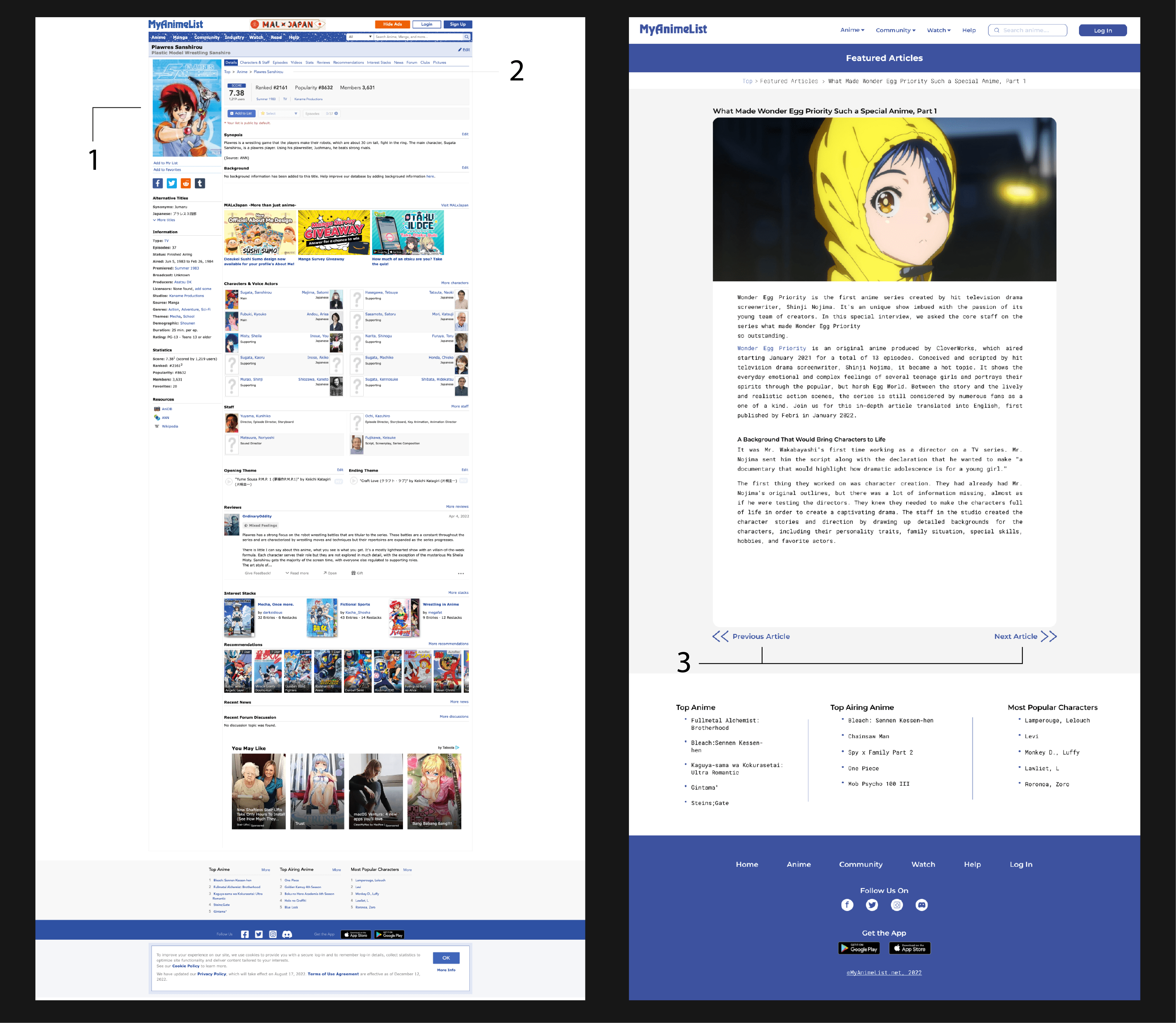
Comparison between original (on left side) and redesigned website(on right side)
Home page
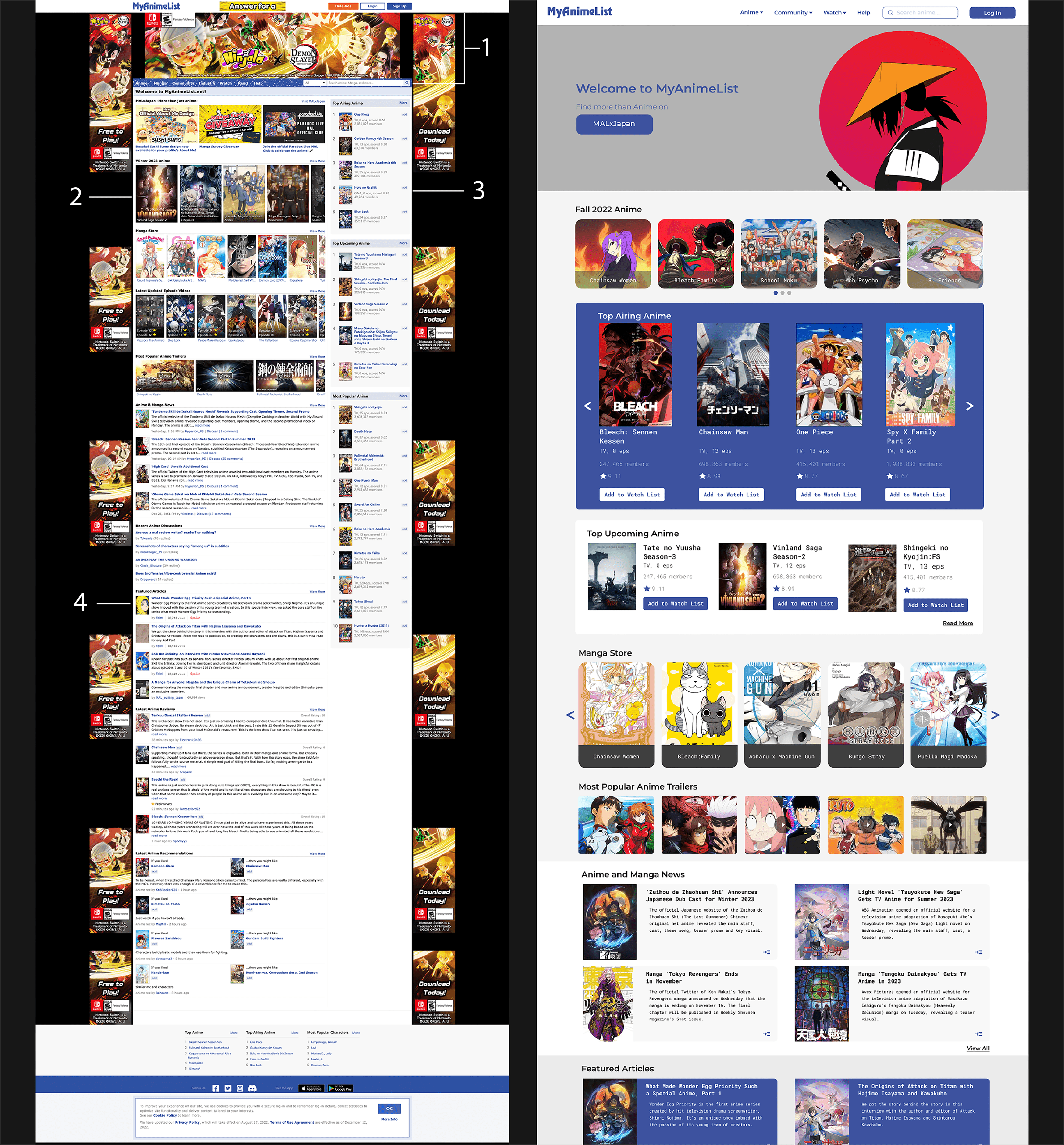
1. Having two navigation bars on a page might prove to be too much for the user. Therefore, I attempted to consolidate them into one and combined elements that could be grouped together.
2. The user interface appeared to be outdated and lacked a proper hierarchy, which made it feel like a jumbled mess of information. To address this, I increased the size of the headings in comparison to the body text. This ensured that the information was presented in a clear and organized manner, allowing users to easily navigate the page without confusion.
3. Insufficient negative space was utilized throughout the page, resulting in an overwhelming experience for the user. To emphasize the top anime, I made the background color distinct from the rest of the page, drawing the user's attention to the section with the highest priority.
4. For some users, reading news text with a larger width could prove difficult. To ensure readability and legibility for all users, I decreased the space specifically for the text.
Article page
1. Although the website is an animelist featuring top anime titles, the absence of text on the page made it challenging for users to understand the specifics of each anime. To address this, I added text to each individual page, making it easier for users to comprehend the details about each anime.
2. By making the anime categories more specific and visible to the user, they will have no trouble locating the category they are looking for.
3. These buttons will help users to switch to next or previous anime articles easily which was absent in the original website.
Next Project- UI Design Challenge- BuzzIt